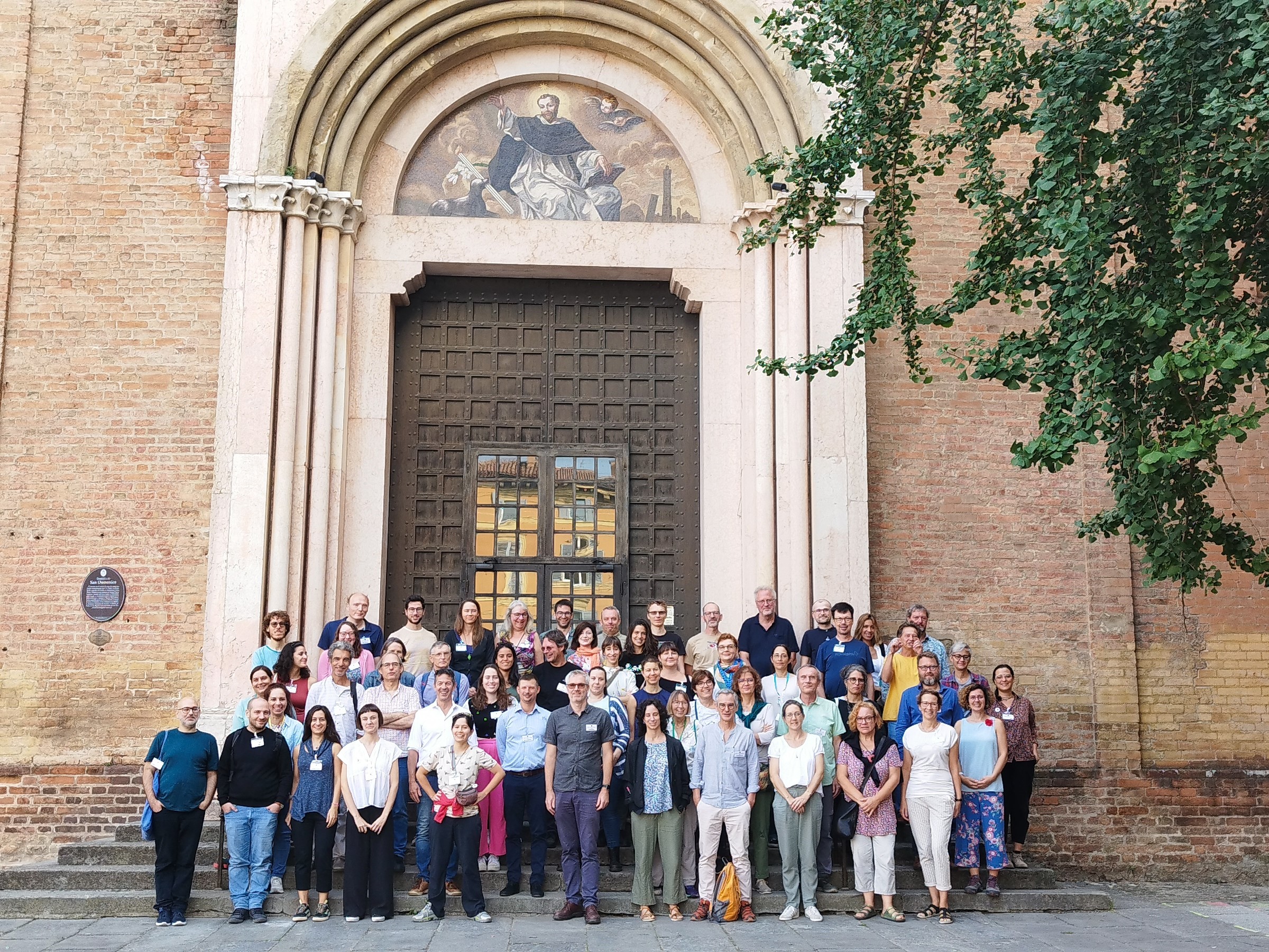
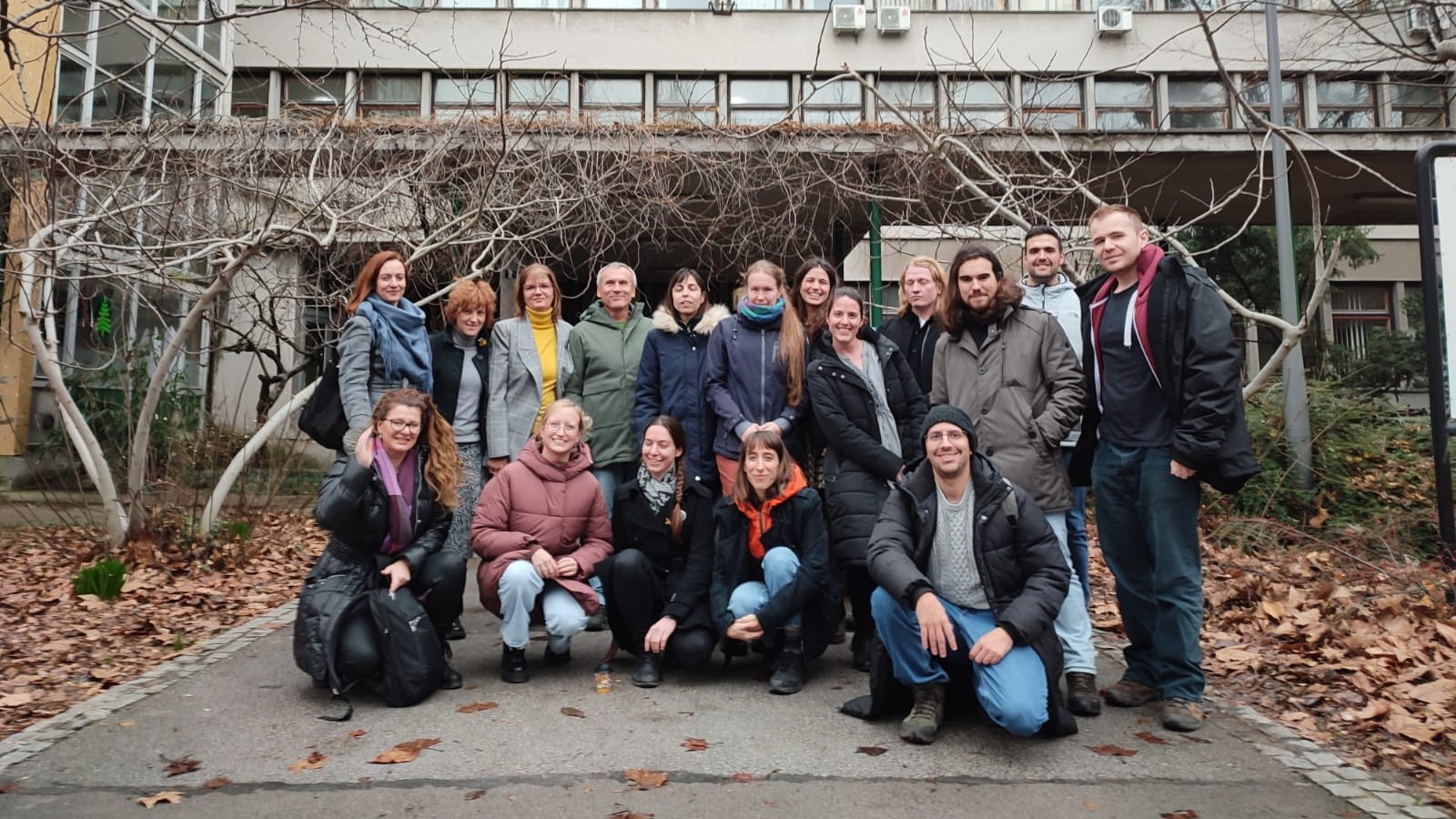
Our project began this spring when our field season officially started. Our project began this spring when our field season officially started. We also started to work on developing our logo at that time, in collaboration with phenomenal studio Verlauf. And over the summer and fall, we worked on creating this web page, in collaboration with an excellent team from Hyper Design Studio.
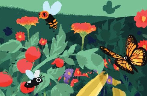
The icon representing our project is an insect put together from Windsor typeset characters, to match the rest of the logo typographically. Windsor typeset was created in 1905 and inspired by nature. Its old-school style gives our insect a certain dose of seriousness and credibility, which pollinators, responsible for the stability of most terrestrial ecosystems and food security, certainly deserve. Our insect seems well-read and friendly. It does not look like any particular insect but represents all, diverse and variable, wild pollinators.
Our logo also has a dynamic version based on the sound of the word BUZZ: it typographically simulates the buzzing of insects. In this version, our logo adapts to the format in which it finds itself, and fills all available space with the sound of pollinating insects. This is our project’s long-term goal: conservation of insects that fill our meadows, forests, parks, and gardens with buzzing sound; and raising the awareness of their importance so we can all remind ourselves that it is good when nature is buzzing.